A continuous random variable has a uniform distribution if all the values belonging to its support have the same probability density.
![]()
The uniform distribution is characterized as follows.
Definition
Let
![]() be a continuous
random variable. Let its
support be a closed
interval of real
numbers:
be a continuous
random variable. Let its
support be a closed
interval of real
numbers:![]() We
say that
We
say that
![]() has a uniform distribution on the interval
has a uniform distribution on the interval
![]() if and only if its
probability density
function
is
if and only if its
probability density
function
is![[eq2]](data:image/gif;base64,R0lGODlhAQABAIAAANvf7wAAACH5BAEAAAAALAAAAAABAAEAAAICRAEAOw==)
A random variable having a uniform distribution is also called a uniform random variable. Sometimes, we also say that it has a rectangular distribution or that it is a rectangular random variable.
To better understand the uniform distribution, you can have a look at its density plots.
The expected value of a uniform random variable
![]() is
is![]()
It
can be derived as
follows:
The variance of a uniform random variable
![]() is
is
We
can use the variance formula
![]() as
follows:
as
follows:![[eq7]](/images/uniform-distribution__12.png)
The moment generating function of a uniform
random variable
![]() is defined for any
is defined for any
![]() :
:![[eq8]](/images/uniform-distribution__15.png)
Using
the definition of moment generating function, we
getNote
that the above derivation is valid only when
![]() .
However, when
.
However, when
![]() :
:![]() Furthermore,
it is easy to verify
that
Furthermore,
it is easy to verify
that![]() When
When
![]() ,
the integral above is well-defined and finite for any
,
the integral above is well-defined and finite for any
![]() .
Thus, the moment generating function of a uniform random variable exists for
any
.
Thus, the moment generating function of a uniform random variable exists for
any
![]() .
.
The characteristic function of a uniform random
variable
![]() is
is![[eq12]](/images/uniform-distribution__25.png)
Using
the definition of characteristic function, we
obtain![[eq13]](/images/uniform-distribution__26.png) Note
that the above derivation is valid only when
Note
that the above derivation is valid only when
![]() .
However, when
.
However, when
![]() :
:![]() Furthermore,
it is easy to verify
that
Furthermore,
it is easy to verify
that![]()
The distribution
function of a uniform random variable
![]() is
is![[eq16]](/images/uniform-distribution__32.png)
If
![]() ,
then
,
then![]() because
because
![]() can not take on values smaller than
can not take on values smaller than
![]() .
If
.
If
![]() ,
thenIf
,
thenIf
![]() ,
then
,
then![]() because
because
![]() can not take on values greater than
can not take on values greater than
![]() .
.
This section shows the plots of the densities of some uniform random variables, in order to demonstrate how the uniform density changes by changing its parameters.
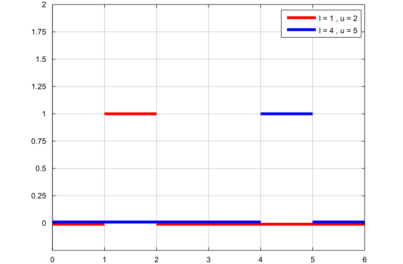
The following plot contains the graphs of two uniform probability density functions:
the first graph (red line) is the probability density function of a uniform
random variable with support
![]() ;
;
the second graph (blue line) is the probability density function of a uniform
random variable with support
![]() .
.
The two random variables have different supports, but their two supports have the same length. Therefore, since the uniform density is constant and inversely proportional to the length of the support, the two random variables have the same constant density over their respective supports.
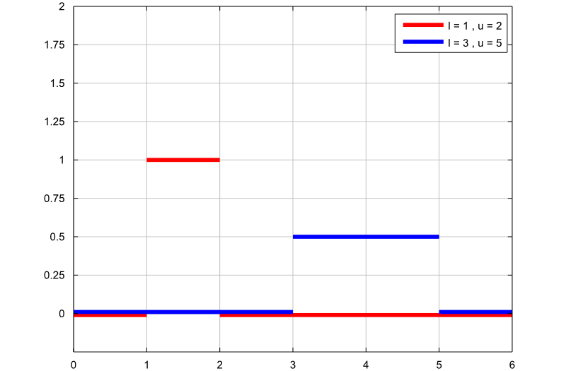
The following plot contains the graphs of two uniform probability density functions:
the first graph (red line) is the probability density function of a uniform
random variable with support
![]() ;
;
the second graph (blue line) is the probability density function of a uniform
random variable with support
![]() .
.
The two random variables have different supports, and the length of
![]() is twice the length of
is twice the length of
![]() .
Therefore, since the uniform density is constant and inversely proportional to
the length of the support, the second random variable has a constant density
which is half the constant density of the first one.
.
Therefore, since the uniform density is constant and inversely proportional to
the length of the support, the second random variable has a constant density
which is half the constant density of the first one.
Below you can find some exercises with explained solutions.
Let
![]() be a uniform random variable with
support
be a uniform random variable with
support![]() Compute the following
probability:
Compute the following
probability:![]()
We can compute this probability by using
the probability density function or the distribution function of
![]() .
Using the probability density function, we
obtain
.
Using the probability density function, we
obtain![[eq26]](/images/uniform-distribution__53.png) Using
the distribution function, we
obtain
Using
the distribution function, we
obtain
Suppose the random variable
![]() has a uniform distribution on the interval
has a uniform distribution on the interval
![]() .
Compute the following
probability:
.
Compute the following
probability:![]()
This probability can be easily computed
by using the distribution function of
![]() :
:
Suppose the random variable
![]() has a uniform distribution on the interval
has a uniform distribution on the interval
![]() .
Compute the third moment of
.
Compute the third moment of
![]() ,
that
is,
,
that
is,![]()
We can compute the third moment of
![]() by using the transformation
theorem:
by using the transformation
theorem:
Please cite as:
Taboga, Marco (2021). "Uniform distribution", Lectures on probability theory and mathematical statistics. Kindle Direct Publishing. Online appendix. https://www.statlect.com/probability-distributions/uniform-distribution.
Most of the learning materials found on this website are now available in a traditional textbook format.