The Gamma distribution is a generalization of the Chi-square distribution.
It plays a fundamental role in statistics because estimators of variance often have a Gamma distribution.
![]()
Table of contents
There are several equivalent parametrizations of the Gamma distribution.
We present one that is particularly convenient in Bayesian applications, and we discuss how it maps to alternative parametrizations.
In our presentation, a Gamma random variable
![]() has two parameters:
has two parameters:
the mean parameter
![]() ,
which determines the expected value of the
distribution:
,
which determines the expected value of the
distribution:![]()
the degrees-of-freedom parameter
![]() ,
which determines the variance of the distribution together with
,
which determines the variance of the distribution together with
![]() :
:![]()
Let
![]() be independent normal random variables with zero mean and unit variance.
be independent normal random variables with zero mean and unit variance.
The variable
![]() has
a Chi-square distribution with
has
a Chi-square distribution with
![]() degrees of freedom.
degrees of freedom.
If
![]() is a strictly positive constant, then the random variable
is a strictly positive constant, then the random variable
![]() defined as
defined as
![]() has
a Gamma distribution with parameters
has
a Gamma distribution with parameters
![]() and
and
![]() .
.
Therefore, a Gamma variable
![]() with parameters
with parameters
![]() and
and
![]() can also be written as the sum of the squares of
can also be written as the sum of the squares of
![]() independent normals having zero mean and variance equal to
independent normals having zero mean and variance equal to
![]() :
:![[eq6]](data:image/gif;base64,R0lGODlhAQABAIAAANvf7wAAACH5BAEAAAAALAAAAAABAAEAAAICRAEAOw==)
In general, the sum of independent squared normal variables that have zero mean and arbitrary variance has a Gamma distribution.
Yet another way to see
![]() is as the sample variance of
is as the sample variance of
![]() normal variables with zero mean and variance
normal variables with zero mean and variance
![]() :
:
Gamma random variables are characterized as follows.
Definition
Let
![]() be a continuous
random variable. Let its
support be the set
of positive real
numbers:
be a continuous
random variable. Let its
support be the set
of positive real
numbers:![]() Let
Let
![]() .
We say that
.
We say that
![]() has a Gamma distribution with parameters
has a Gamma distribution with parameters
![]() and
and
![]() if and only if its
probability density
function
iswhere
if and only if its
probability density
function
iswhere
![]() is a
constant:and
is a
constant:and
![]() is the Gamma function.
is the Gamma function.
To better understand the Gamma distribution, you can have a look at its density plots.
Here we discuss two alternative parametrizations reported on Wikipedia. You can safely skip this section on a first reading.
The first alternative parametrization is obtained by setting
![]() and
and
![]() ,
under which:
,
under which:
the density on the support
is![]()
the mean
is![]()
the variance
is![]()
The second alternative parametrization is obtained by setting
![]() and
and
![]() ,
under which:
,
under which:
the density on the support
is![]()
the mean
is![]()
the variance
is![]()
Although these two parametrizations yield more compact expressions for the density, the one we present often generates more readable results when it is used in Bayesian statistics and in variance estimation.
The expected value of a Gamma random variable
![]() is
is![]()
The
mean can be derived as
follows:![[eq21]](/images/gamma-distribution__47.png)
The variance of a Gamma random variable
![]() is
is![]()
It
can be derived thanks to the usual
variance formula
(![]() ):
):![[eq24]](/images/gamma-distribution__51.png)
The moment generating function of a Gamma random
variable
![]() is defined for any
is defined for any
![]() :
:![]()
By
using the definition of moment generating function, we
obtain![[eq26]](/images/gamma-distribution__55.png) where
the integral equals
where
the integral equals
![]() because it is the integral of the probability density function of a Gamma
random variable with parameters
because it is the integral of the probability density function of a Gamma
random variable with parameters
![]() and
and
![]() .
Thus,Of
course, the above integrals converge only if
.
Thus,Of
course, the above integrals converge only if
![]() ,
i.e. only if
,
i.e. only if
![]() .
Therefore, the moment generating function of a Gamma random variable exists
for all
.
Therefore, the moment generating function of a Gamma random variable exists
for all
![]() .
.
The characteristic function of a Gamma random
variable
![]() is
is![]()
It can be derived by using the definition of
characteristic function and a Taylor series
expansion:![[eq31]](/images/gamma-distribution__65.png)
The distribution function
of a Gamma random variable
iswhere
the
functionis
called lower incomplete Gamma function and is
usually evaluated using specialized computer algorithms.
This is proved as
follows:![[eq34]](/images/gamma-distribution__68.png)
In the following subsections you can find more details about the Gamma distribution.
If a variable
![]() has the Gamma distribution with parameters
has the Gamma distribution with parameters
![]() and
and
![]() ,
then
,
then![]() where
where
![]() has a Chi-square distribution with
has a Chi-square distribution with
![]() degrees of freedom.
degrees of freedom.
For notational simplicity, denote
![]() by
by
![]() in what follows. Note that
in what follows. Note that
![]() is
a strictly increasing function of
is
a strictly increasing function of
![]() ,
since
,
since
![]() is strictly positive. Therefore, we can use the formula for the
density of an increasing function of a
continuous
variable:The
density function of a Chi-square random variable with
is strictly positive. Therefore, we can use the formula for the
density of an increasing function of a
continuous
variable:The
density function of a Chi-square random variable with
![]() degrees of freedom
iswhere
Therefore,
degrees of freedom
iswhere
Therefore,![[eq40]](/images/gamma-distribution__84.png) which
is the density of a Gamma distribution with parameters
which
is the density of a Gamma distribution with parameters
![]() and
and
![]() .
.
Thus, the Chi-square distribution is a special case of the Gamma distribution
because, when
![]() ,
we
have
,
we
have![]()
In other words, a Gamma distribution with parameters
![]() and
and
![]() is just a Chi square distribution with
is just a Chi square distribution with
![]() degrees of freedom.
degrees of freedom.
By multiplying a Gamma random variable by a strictly positive constant, one obtains another Gamma random variable.
If
![]() is a Gamma random variable with parameters
is a Gamma random variable with parameters
![]() and
and
![]() ,
then the random variable
,
then the random variable
![]() defined
as
defined
as![]() has
a Gamma distribution with parameters
has
a Gamma distribution with parameters
![]() and
and
![]() .
.
This can be easily seen using the result
from the previous
subsection:![]() where
where
![]() has a Chi-square distribution with
has a Chi-square distribution with
![]() degrees of freedom.
Therefore,
degrees of freedom.
Therefore,![]() In
other words,
In
other words,
![]() is equal to a Chi-square random variable with
is equal to a Chi-square random variable with
![]() degrees of freedom, divided by
degrees of freedom, divided by
![]() and multiplied by
and multiplied by
![]() .
Therefore, it has a Gamma distribution with parameters
.
Therefore, it has a Gamma distribution with parameters
![]() and
and
![]() .
.
In the lecture on the Chi-square distribution, we
have explained that a Chi-square random variable
![]() with
with
![]() degrees of freedom
(
degrees of freedom
(![]() integer) can be written as a sum of squares of
integer) can be written as a sum of squares of
![]() independent normal random variables
independent normal random variables
![]() ,
...,
,
...,![]() having mean
having mean
![]() and variance
and variance
![]() :
:![]()
In the previous subsections we have seen that a variable
![]() having a Gamma distribution with parameters
having a Gamma distribution with parameters
![]() and
and
![]() can be written
as
can be written
as![]() where
where
![]() has a Chi-square distribution with
has a Chi-square distribution with
![]() degrees of freedom.
degrees of freedom.
Putting these two things together, we
obtainwhere
we have
defined
But the variables
![]() are normal random variables with mean
are normal random variables with mean
![]() and variance
and variance
![]() .
.
Therefore, a Gamma random variable with parameters
![]() and
and
![]() can be seen as a sum of squares of
can be seen as a sum of squares of
![]() independent normal random variables having zero mean and variance
independent normal random variables having zero mean and variance
![]() .
.
We now present some plots that help us to understand how the shape of the Gamma distribution changes when its parameters are changed.
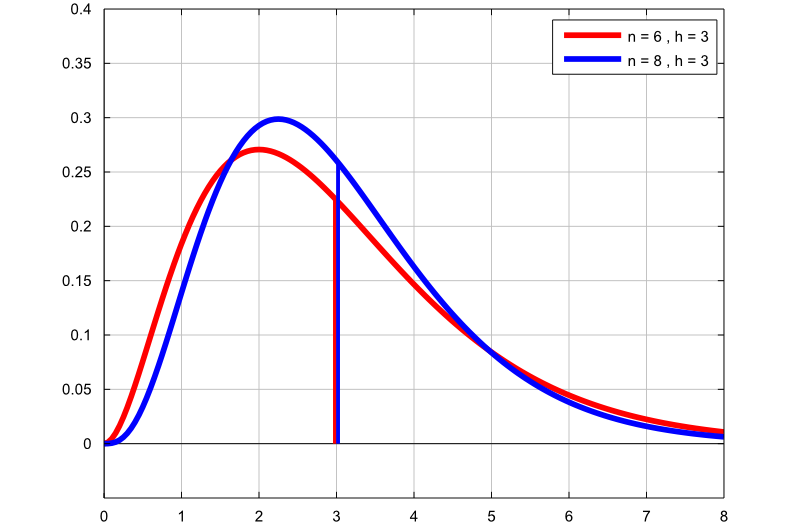
The following plot contains two lines:
the first one (red) is the pdf of a Gamma random variable with
![]() degrees of freedom and mean
degrees of freedom and mean
![]() ;
;
the second one (blue) is obtained by setting
![]() and
and
![]() .
.
Because
![]() in both cases, the two distributions have the same mean.
in both cases, the two distributions have the same mean.
However, by increasing
![]() from
from
![]() to
to
![]() ,
the shape of the distribution changes. The more we increase the degrees of
freedom, the more the pdf resembles that of a normal distribution.
,
the shape of the distribution changes. The more we increase the degrees of
freedom, the more the pdf resembles that of a normal distribution.
The thin vertical lines indicate the means of the two distributions.
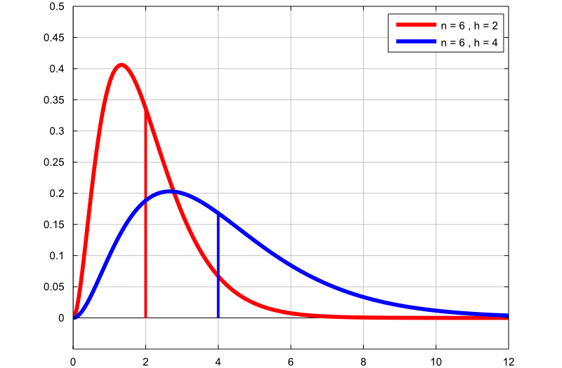
In this plot:
the first line (red) is the pdf of a Gamma random variable with
![]() degrees of freedom and mean
degrees of freedom and mean
![]() ;
;
the second one (blue) is obtained by setting
![]() and
and
![]() .
.
Increasing the parameter
![]() changes the mean of the distribution from
changes the mean of the distribution from
![]() to
to
![]() .
.
However, the two distributions have the same number of degrees of freedom
(![]() ).
Therefore, they have the same shape. One is the "stretched version of the
other". It would look exactly the same on a different scale.
).
Therefore, they have the same shape. One is the "stretched version of the
other". It would look exactly the same on a different scale.
Below you can find some exercises with explained solutions.
Let
![]() and
and
![]() be two independent Chi-square random variables having
be two independent Chi-square random variables having
![]() and
and
![]() degrees of freedom respectively.
degrees of freedom respectively.
Consider the following random
variables:
What distribution do they have?
Being multiples of Chi-square random
variables, the variables
![]() ,
,
![]() and
and
![]() all have a Gamma distribution. The random variable
all have a Gamma distribution. The random variable
![]() has
has
![]() degrees of freedom and the random variable
degrees of freedom and the random variable
![]() can be written
as
can be written
as![]() where
where
![]() .
Therefore
.
Therefore
![]() has a Gamma distribution with parameters
has a Gamma distribution with parameters
![]() and
and
![]() .
The random variable
.
The random variable
![]() has a Chi-square distribution with
has a Chi-square distribution with
![]() degrees of freedom, because
degrees of freedom, because
![]() and
and
![]() are independent (see the lecture on the
Chi-square distribution), and the random
variable
are independent (see the lecture on the
Chi-square distribution), and the random
variable
![]() can be written
as
can be written
as![]() where
where
![]() .
Therefore
.
Therefore
![]() has a Gamma distribution with parameters
has a Gamma distribution with parameters
![]() and
and
![]() .
.
Let
![]() be a random variable having a Gamma distribution with parameters
be a random variable having a Gamma distribution with parameters
![]() and
and
![]() .
.
Define the following random
variables:
What distribution do these variables have?
Multiplying a Gamma random variable by a
strictly positive constant one still obtains a Gamma random variable. In
particular, the random variable
![]() is a Gamma random variable with parameters
is a Gamma random variable with parameters
![]() and
and
![]() The random variable
The random variable
![]() is a Gamma random variable with parameters
is a Gamma random variable with parameters
![]() and
and
![]() The random variable
The random variable
![]() is a Gamma random variable with parameters
is a Gamma random variable with parameters
![]() and
and
![]() The
random variable
The
random variable
![]() is also a Chi-square random variable with
is also a Chi-square random variable with
![]() degrees of freedom (remember that a Gamma random variable with parameters
degrees of freedom (remember that a Gamma random variable with parameters
![]() and
and
![]() is also a Chi-square random variable when
is also a Chi-square random variable when
![]() ).
).
Let
![]() ,
,
![]() and
and
![]() be mutually independent normal random
variables having mean
be mutually independent normal random
variables having mean
![]() and variance
and variance
![]() .
.
Consider the random
variable![]()
What distribution does
![]() have?
have?
The random variable
![]() can be written as
where
can be written as
where
![]() ,
,
![]() and
and
![]() are mutually independent standard normal random
variables. The sum
are mutually independent standard normal random
variables. The sum
![]() has a Chi-square distribution with
has a Chi-square distribution with
![]() degrees of freedom (see the lecture entitled
Chi-square distribution). Therefore
degrees of freedom (see the lecture entitled
Chi-square distribution). Therefore
![]() has a Gamma distribution with parameters
has a Gamma distribution with parameters
![]() and
and
![]() .
.
Please cite as:
Taboga, Marco (2021). "Gamma distribution", Lectures on probability theory and mathematical statistics. Kindle Direct Publishing. Online appendix. https://www.statlect.com/probability-distributions/gamma-distribution.
Most of the learning materials found on this website are now available in a traditional textbook format.