A random variable has a Chi-square distribution if it can be written as a sum of squares of independent standard normal variables.
Sums of this kind are encountered very often in statistics, especially in the estimation of variance and in hypothesis testing.
In this lecture, we derive the formulae for the mean, the variance and other characteristics of the chi-square distribution.
![]()
Table of contents
We will prove below that a random variable
![]() has a Chi-square distribution if it can be written
as
has a Chi-square distribution if it can be written
as![]() where
where
![]() ,
...,
,
...,
![]() are mutually independent standard normal random
variables.
are mutually independent standard normal random
variables.
The number
![]() of variables is the only parameter of the distribution, called the degrees of
freedom parameter. It determines both the mean (equal to
of variables is the only parameter of the distribution, called the degrees of
freedom parameter. It determines both the mean (equal to
![]() )
and the variance (equal to
)
and the variance (equal to
![]() ).
).
Chi-square random variables are characterized as follows.
Definition
Let
![]() be a continuous
random variable. Let its
support be the set
of positive real
numbers:
be a continuous
random variable. Let its
support be the set
of positive real
numbers:![]() Let
Let
![]() .
We say that
.
We say that
![]() has a Chi-square distribution with
has a Chi-square distribution with
![]() degrees of freedom if and only if its
probability density
function
is
degrees of freedom if and only if its
probability density
function
is![[eq3]](data:image/gif;base64,R0lGODlhAQABAIAAANvf7wAAACH5BAEAAAAALAAAAAABAAEAAAICRAEAOw==) where
where
![]() is a
constant:and
is a
constant:and
![]() is the Gamma function.
is the Gamma function.
To better understand the Chi-square distribution, you can have a look at its density plots.
The following notation is often employed to indicate that a random variable
![]() has a Chi-square distribution with
has a Chi-square distribution with
![]() degrees of
freedom:
degrees of
freedom:![]() where
the symbol
where
the symbol
![]() means "is distributed as".
means "is distributed as".
The expected value of a Chi-square random
variable
![]() is
is![]()
It
can be derived as
follows:
The proof above uses the probability density function of the distribution. An
alternative, simpler proof exploits the representation (demonstrated below) of
![]() as a sum of squared normal variables.
as a sum of squared normal variables.
We can
write![]() where
where
![]() are independent standard normal variables. Then, we
havebecause
a standard normal variable has zero mean and unit variance.
are independent standard normal variables. Then, we
havebecause
a standard normal variable has zero mean and unit variance.
The variance of a Chi-square random variable
![]() is
is![]()
It
can be derived thanks to the usual
variance formula
(![]() ):
):
Again, there is also a simpler proof based on the representation (demonstrated
below) of
![]() as a sum of squared normal variables.
as a sum of squared normal variables.
We can
write![]() where
where
![]() are independent standard normal variables. Then, we
havebecause
a standard normal variable has zero mean, unit variance and fourth moment
equal to
are independent standard normal variables. Then, we
havebecause
a standard normal variable has zero mean, unit variance and fourth moment
equal to
![]() .
.
The moment generating function of a Chi-square
random variable
![]() is defined for any
is defined for any
![]() :
:![]()
Using
the definition of moment generating function, we
obtain![[eq19]](/images/chi-square-distribution__40.png) The
integral above is well-defined and finite only when
The
integral above is well-defined and finite only when
![]() ,
i.e., when
,
i.e., when
![]() .
Thus, the moment generating function of a Chi-square random variable exists
for any
.
Thus, the moment generating function of a Chi-square random variable exists
for any
![]() .
.
The characteristic function of a Chi-square
random variable
![]() is
is![]()
Using
the definition of characteristic function, we
obtain:![[eq21]](/images/chi-square-distribution__46.png)
The distribution function
of a Chi-square random variable
iswhere
the
function![]() is
called lower incomplete Gamma function and is
usually computed by means of specialized computer algorithms.
is
called lower incomplete Gamma function and is
usually computed by means of specialized computer algorithms.
This is proved as
follows:![[eq24]](/images/chi-square-distribution__49.png)
Usually, it is possible to resort to computer algorithms that directly compute
the values of
![]() .
For example, the MATLAB command
.
For example, the MATLAB command
chi2cdf(x,n)
returns the value at the point x of the distribution
function of a Chi-square random variable with
n degrees of freedom.
In the past, when computers were not widely available, people used to look up
the values of
![]() in Chi-square distribution tables, where
in Chi-square distribution tables, where
![]() is tabulated for several values of
is tabulated for several values of
![]() and
and
![]() (see the lecture entitled
Chi-square distribution
values).
(see the lecture entitled
Chi-square distribution
values).
In the following subsections you can find more details about the Chi-square distribution.
Let
![]() be a Chi-square random variable with
be a Chi-square random variable with
![]() degrees of freedom and
degrees of freedom and
![]() another Chi-square random variable with
another Chi-square random variable with
![]() degrees of freedom. If
degrees of freedom. If
![]() and
and
![]() are independent, then their sum has a Chi-square
distribution with
are independent, then their sum has a Chi-square
distribution with
![]() degrees of
freedom:This
can be generalized to sums of more than two Chi-square random variables,
provided they are mutually
independent:
degrees of
freedom:This
can be generalized to sums of more than two Chi-square random variables,
provided they are mutually
independent:![[eq29]](/images/chi-square-distribution__63.png)
This can be easily proved
using moment generating functions. The moment generating function of
![]() is
is![]() DefineThe
moment generating function of a sum of mutually independent random variables
is just the product of their moment generating
functions:where
Therefore,
the moment generating function of
DefineThe
moment generating function of a sum of mutually independent random variables
is just the product of their moment generating
functions:where
Therefore,
the moment generating function of
![]() is the moment generating function of a Chi-square random variable with
is the moment generating function of a Chi-square random variable with
![]() degrees of freedom, and, as a consequence,
degrees of freedom, and, as a consequence,
![]() is a Chi-square random variable with
is a Chi-square random variable with
![]() degrees of freedom.
degrees of freedom.
Let
![]() be a standard normal random variable and let
be a standard normal random variable and let
![]() be its
square:
be its
square:![]() Then
Then
![]() is a Chi-square random variable with 1 degree of freedom.
is a Chi-square random variable with 1 degree of freedom.
For
![]() ,
the distribution function of
,
the distribution function of
![]() is
is![[eq35]](/images/chi-square-distribution__79.png) where
where
![]() is the probability density function of a standard normal random
variable:For
is the probability density function of a standard normal random
variable:For
![]() ,
,
![]() because
because
![]() ,
being a square, cannot be negative. Using
Leibniz integral
rule and the fact that the density function is the derivative of the
distribution function, the probability density function of
,
being a square, cannot be negative. Using
Leibniz integral
rule and the fact that the density function is the derivative of the
distribution function, the probability density function of
![]() ,
denoted by
,
denoted by
![]() ,
is obtained as follows (for
,
is obtained as follows (for
![]() ):
):![[eq40]](/images/chi-square-distribution__88.png) For
For
![]() ,
trivially,
,
trivially,
![]() .
As a
consequence,Therefore,
.
As a
consequence,Therefore,
![]() is the probability density function of a Chi-square random variable with 1
degree of freedom.
is the probability density function of a Chi-square random variable with 1
degree of freedom.
Combining the two facts above, one trivially obtains that the sum of squares
of
![]() independent standard normal random variables is a Chi-square random variable
with
independent standard normal random variables is a Chi-square random variable
with
![]() degrees of freedom.
degrees of freedom.
This section shows the plots of the densities of some Chi-square random variables. These plots help us to understand how the shape of the Chi-square distribution changes by changing the degrees of freedom parameter.
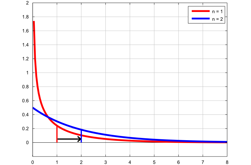
The following plot contains the graphs of two density functions:
the first graph (red line) is the probability density function of a Chi-square
random variable with
![]() degrees of freedom;
degrees of freedom;
the second graph (blue line) is the probability density function of a
Chi-square random variable with
![]() degrees of freedom.
degrees of freedom.
The thin vertical lines indicate the means of the two distributions. By increasing the number of degrees of freedom, we increase the mean of the distribution, as well as the probability density of larger values.
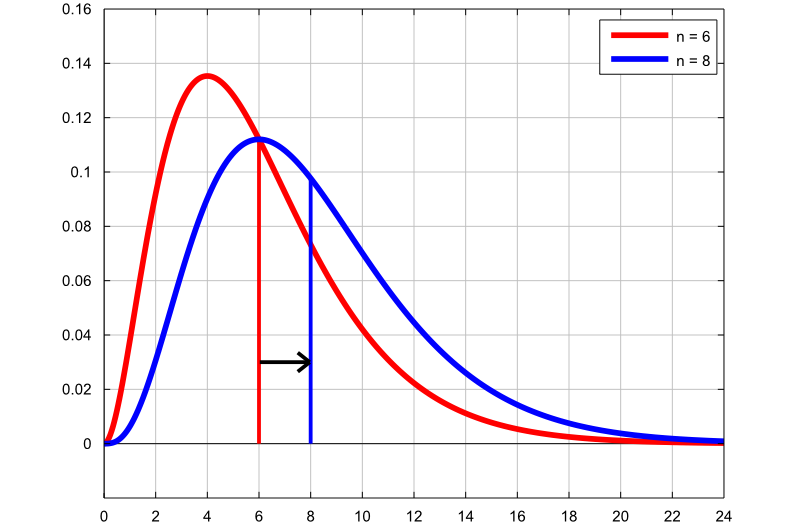
The following plot also contains the graphs of two density functions:
the first graph (red line) is the probability density function of a Chi-square
random variable with
![]() degrees of freedom;
degrees of freedom;
the second graph (blue line) is the probability density function of a
Chi-square random variable with
![]() degrees of freedom.
degrees of freedom.
As in the previous plot, the mean of the distribution increases as the degrees of freedom are increased.
Below you can find some exercises with explained solutions.
Let
![]() be a chi-square random variable with
be a chi-square random variable with
![]() degrees of freedom.
degrees of freedom.
Compute the following
probability:![]()
First of all, we need to express the
above probability in terms of the distribution function of
![]() :
:![[eq45]](/images/chi-square-distribution__103.png) where
the
valuescan
be computed with a computer algorithm or found in a Chi-square distribution
table (see the lecture entitled
Chi-square distribution
values).
where
the
valuescan
be computed with a computer algorithm or found in a Chi-square distribution
table (see the lecture entitled
Chi-square distribution
values).
Let
![]() and
and
![]() be two independent normal random variables having mean
be two independent normal random variables having mean
![]() and variance
and variance
![]() .
.
Compute the following
probability:![]()
First of all, the two variables
![]() and
and
![]() can be written
aswhere
can be written
aswhere
![]() and
and
![]() are two standard normal random variables. Thus, we can
writebut
the sum
are two standard normal random variables. Thus, we can
writebut
the sum
![]() has a Chi-square distribution with
has a Chi-square distribution with
![]() degrees of freedom.
Therefore,where
degrees of freedom.
Therefore,where
![]() is the distribution function of a Chi-square random variable
is the distribution function of a Chi-square random variable
![]() with
with
![]() degrees of freedom, evaluated at the point
degrees of freedom, evaluated at the point
![]() .
With any computer package for statistics, we can
find
.
With any computer package for statistics, we can
find![]()
Suppose that the random variable
![]() has a Chi-square distribution with
has a Chi-square distribution with
![]() degrees of freedom.
degrees of freedom.
Define the random variable
![]() as
follows:
as
follows:![]()
Compute the expected value of
![]() .
.
The expected value of
![]() can be easily calculated using the moment generating function of
can be easily calculated using the moment generating function of
![]() :Now,
by exploiting the linearity of the expected value, we
obtain
:Now,
by exploiting the linearity of the expected value, we
obtain
Please cite as:
Taboga, Marco (2021). "Chi-square distribution", Lectures on probability theory and mathematical statistics. Kindle Direct Publishing. Online appendix. https://www.statlect.com/probability-distributions/chi-square-distribution.
Most of the learning materials found on this website are now available in a traditional textbook format.